
Overview
Freshly leadership wanted to see an increase in first-time site visitors converting to customers. In order to do this, the product, engineering, data, marketing, and merchandising teams banded together to run a series of tests, experimenting with different aspects of the funnel to see what impact it may make on conversion.
Duration
October 2022-
Role
Lead Product Designer
Skills
-
Product Strategy
-
Interaction & Visual Design (Mobile and Desktop)
-
Prototyping
-
User Testing
Problem
"In order to optimize Freshly’s website experience for first-time users, how might we condense the new customer flow to fewer steps and reduce friction to checkout?"
Let's take a look at the old funnel flow...

Based on Freshly data from the last year
-
Homepage funnel lost 55% of unique visitors on the Web platform and 64% on the Mobile Web at the Lead Form step
-
Converting just half of those abandoning the funnel currently, effectively translates into 0.36% conversion gain
-
Converting just 0.75% of abandons yields us 0.54% conversion gain
Solution
I worked closely with our growth PM to strategize a shorter more effective funnel flow. The primary focus was put on the homepage, where we see the highest drop-off in users. We eliminated the lead form and replaced it with a CTA that leads users directly to the menu. Additionally, we eliminated the plans page and the delivery date page.
The redesigned funnel flow is now a 3-step process
.png)
Let's take a deeper dive into these design changes
Homepage Changes
On the Homepage, we eliminated the lead form where we captured email and zip code and replaced it with a CTA that leads users directly to the menu to get them into the funnel quicker. The lead form is where we originally saw the biggest drop-off in users.
Menu Changes
To reduce steps in the flow, we eliminated the homepage lead form and delivery day selector page. In place of these pages, we added a pre-populated, fixed bar that allows users to update their zip code and delivery day on the menu. Changes to zip code and delivery date may impact meal options on the menu. Additionally, any changes to meal selection could lead to an update in the user's cart. We worked diligently to account for different error states in this step.
Checkout Changes
We added an input field at the top of the screen for the user to update their zip code on the checkout page. As previously stated, zip code and delivery date can make impactful changes to menu meal options, and we want the user to make those changes as soon as possible if they are going to update either of those fields on this screen.
Handling Error States
In order to account for the different updates to menu meal options due to changes in zip code and the delivery date we had to design a handful of modal errors.
Zip Code Errors

A user updates their zip code and it impacts their delivery date

A user updates their zip code and it impacts the meals in their cart

A user updates their zip code and it impacts their delivery date and the meals in their cart

A user updates their zip code and it is outside of the areas we currently deliver to
Delivery Date Errors
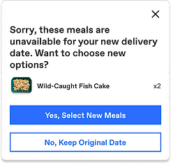
A user updates their delivery date and it impacts the meals in their cart
User Research
We user-tested these designs with a prototype to understand friction points within the funnel.
Key Takeaways
-
7/7 users thought the funnel was clear and quick to navigate
-
6/7 users are not sure what the auto-filled zip code represents
-
4/7 users have questions about the zip code error state
-
3/7 user have questions about the delivery date error state
After receiving this feedback from UX Research we made the following changes
-
Adding a heading to the zip code and delivery date sections in the fixed bar
-
Working with our copywriter to improve copy on zip code and error state modals and are currently testing to see if users better understand them
Implementation & Site Performance
Our goal was to launch this new funnel flow before the end of 2022 starting with 20% of visitors, but we unfortunately never got the chance to go live.