
Context
Group Subscriptions are one of Bloomberg Media's most significant opportunities to increase revenue. The previous Group Subscription landing page was built in 2022, with significant formatting restrictions.
Today, the Group Subscription business has matured, and we need a landing page that reflects that to increase sales
Duration
December 2023-February 2024
Role
Lead Product Designer
Skills
-
Product Strategy
-
Competitive Analysis
-
Interaction & Visual Design
Problem Statement
How might we redesign our Group Subscriptions page to better showcase our product offerings and increase potential leads?
Old Group Subscriptions Page
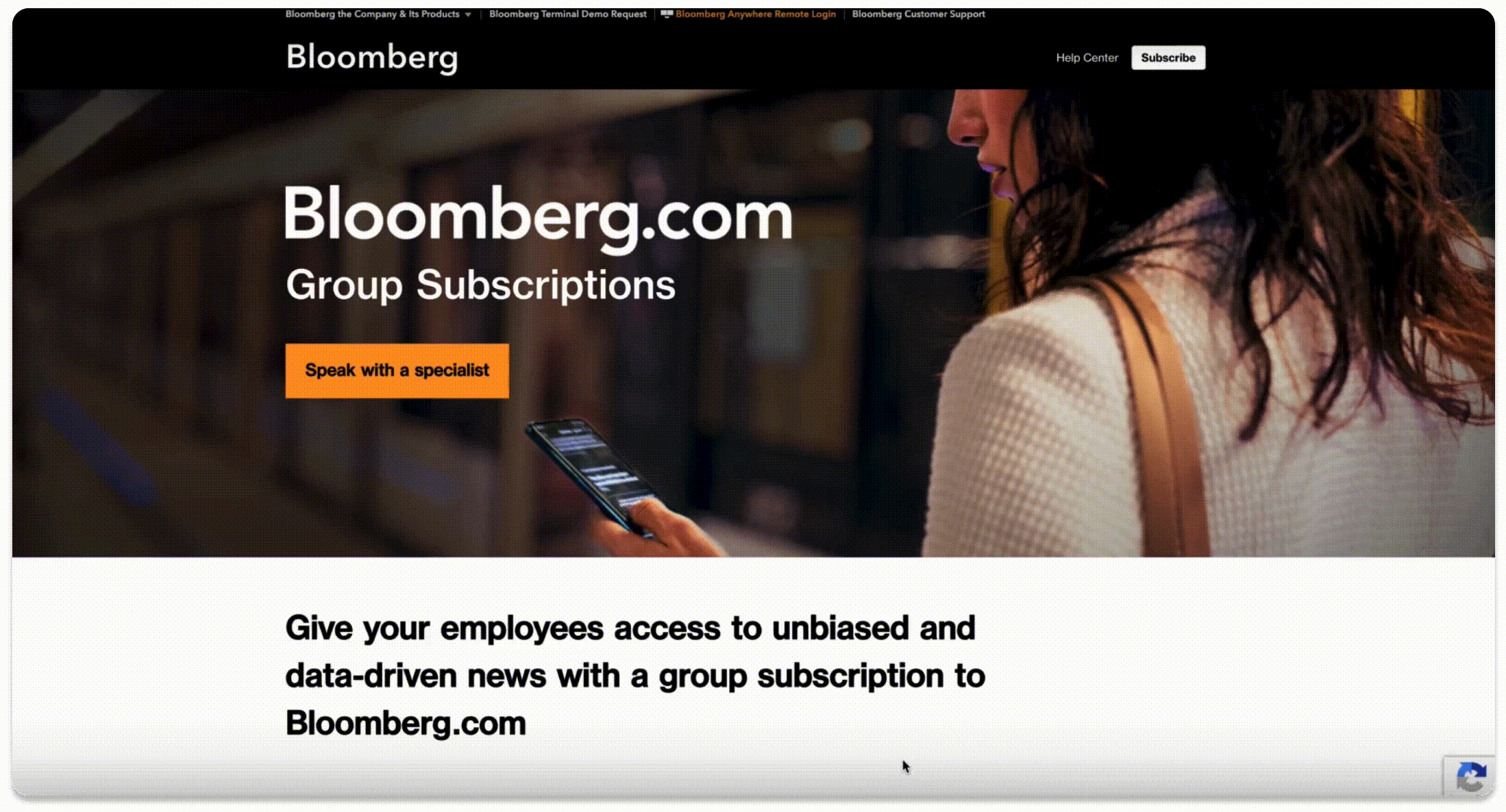
Our Group Subscriptions page was originally built in 2022 and had not been touched since.
We hoped to address the following issues with this page:
-
Poor overall UX/UI
-
Current copy and images don't showcase subscription benefits
-
Form is too low below the fold
-
Page is not optimized for search
Competitive Analysis
Before beginning the redesign process, I took some time to see what the competitive landscape was like.

Pros:
-
Email lead at the top of the page
-
Attention-grabbing bullets that sell the product
-
Easily discoverable pricing info and contact for support
Cons:
-
Imagery doesn't really give any insight into the product
.png)
Pros
-
Length of the page is not very long
-
Short and concise bullets on offerings
Cons
-
Full form below the fold
-
Imagery is not very compelling

Pros
-
Overall page is short
-
Engaging price calculator
Cons
-
Subscriber benefits are very vague
-
No email capture
.jpeg)
Pros
-
Full email lead at the top of the page
-
Benefits and testimonials are short and sweet
-
Effective use of illustration to engage user
Design Goals/Exploration
I was able to use inspiration from my competitive analysis to jump into design exploration and ideation


Final Solution
After plenty of iteration, we landed on a final design that we felt confident in that hit our design goals
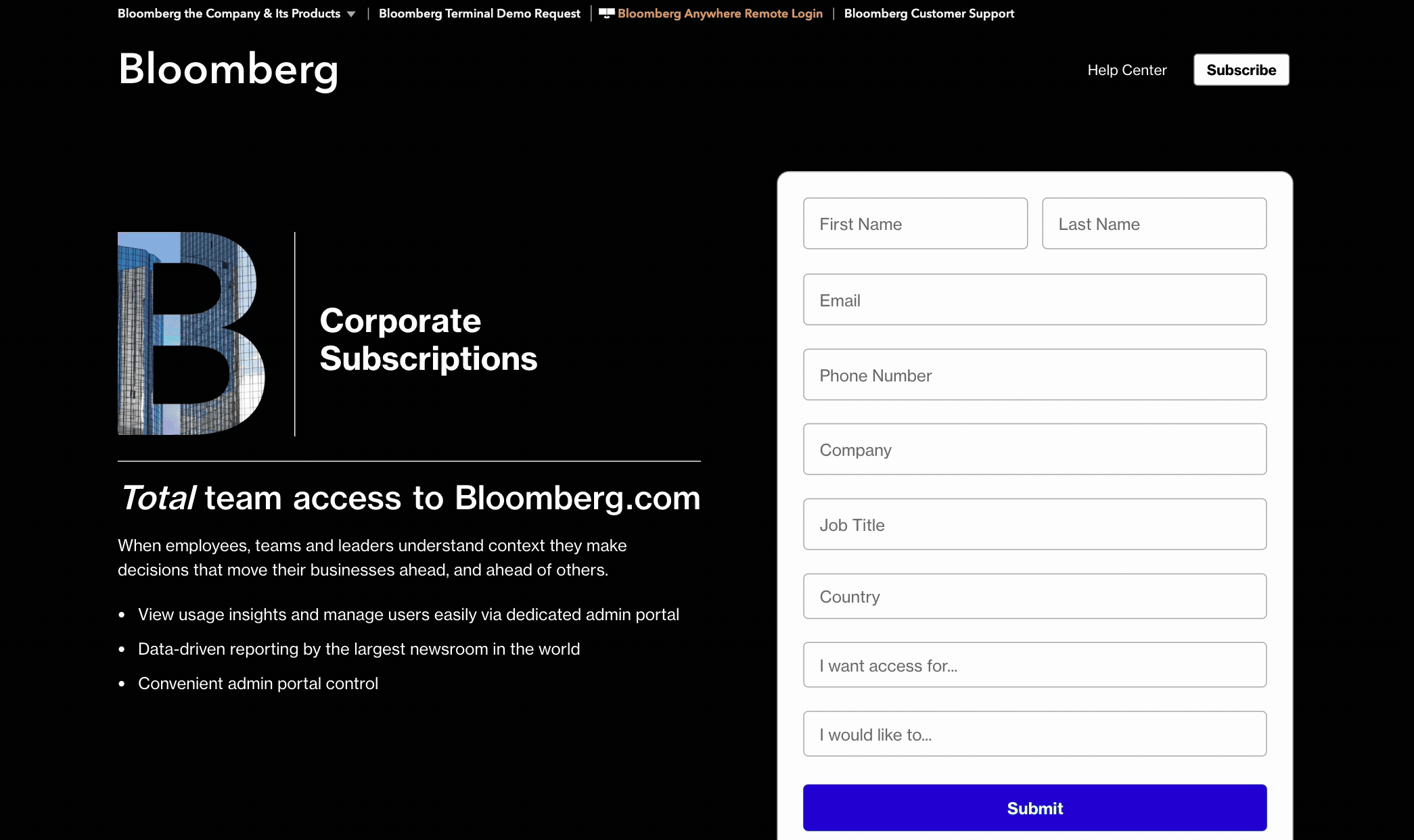
I drew inspiration from competitors to redesign the layout so users could absorb the information while minimizing cognitive load. I also worked with our marketing team to see if we had stronger assets that better sold all the amazing benefits of our Group Subscription. After reestablishing copy and images, we landed on a final design that not only met business needs but was user-friendly and worked within WordPress's constraints. The key upgrades in this redesign include:
-
Compelling imagery and key benefits now lead the page
-
Our lead form is higher on the page and less intimidating
-
Tab menu with visuals helps show the breadth of the subscription and how it's useful across departments
-
Bulleted alternating sections deliver plan details in a clean and organized format with additional supporting imagery
Impact/Performance
We saw really impressive data early on in the new landing page's release that has only continued to improve
In the first 15 days we saw
-
300+ partial leads: people who gave us their email address
-
131% increase in actionable leads
-
50% increase in form submission
As of now numbers look like
.png)
What we've launched since then
.png)
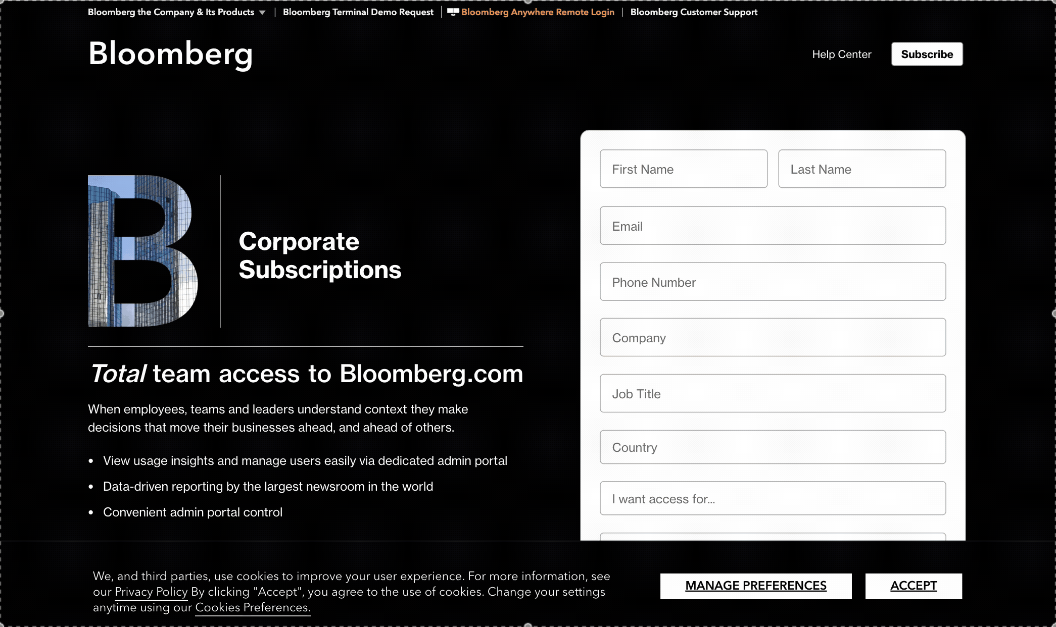
Full form at the top of the page
We swapped the skinny lead for a full lead form at the top of the page to increase the quality of our leads
Academic vs Corporate
We added an academic version of this landing page specifically for institutions that can be accessed via hyperlink
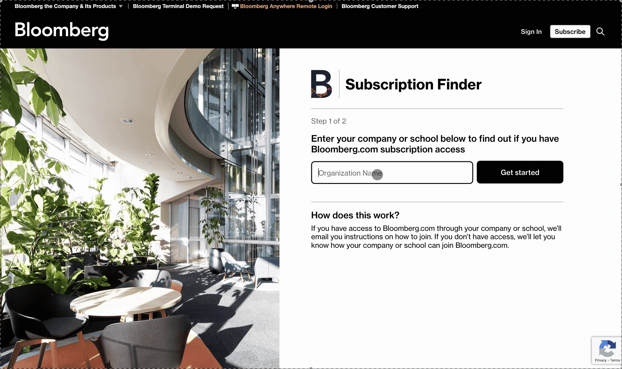
Subs finder
We created a portal where users can easily discover whether they have access to a group subscription through their company or institution